


Notion Capital Introduction
Notion Capital
Capturing the essence of the brand experience.
Notion Capital Introduction
Notion Capital
Capturing the essence of the brand experience.
Crafting the finishing touches to its annual retreat, Notion Capital requested an identity that would inspire and capture the essence of 'Deconstructing Peak Performance'. Aimed at Notion's entrepreneurs and venture capitalists audience, the identity was to work across all touch points before, during and after the event.
Utilising geometric shapes that could be manipulated and duplicated, I created a series of creative solutions focused around 'deconstruction'. The chosen creative route focused on 'a clarity of vision'; a clean and contemporary identity representing the focus required to ensure success within the start-up industry.
Notion Capital Design Direction 1a
Notion Capital Design Direction 1a
Notion Capital Design Direction 1b
Notion Capital Design Direction 1b
Notion Capital Design Direction 2a
Notion Capital Design Direction 2a
Notion Capital Design Direction 2b
Notion Capital Design Direction 2b
Notion Capital Design Direction 3a
Notion Capital Design Direction 3a
Notion Capital Design Direction 3b
Notion Capital Design Direction 3b
Repeat
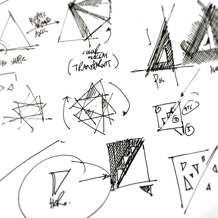
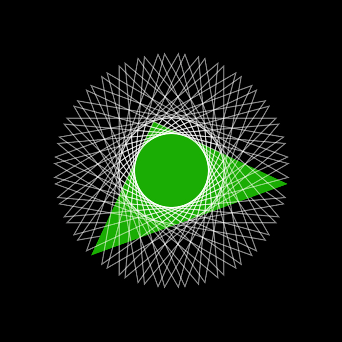
For Notion Capital's first retreat I wanted to use a 'hero' graphic that would be strong enough to carry the core message of 'deconstruction'. Various shapes where considered and taking the right-angles from the Notion N, a triangle was utilised as the hero.
Geometric
The shape, through all of the design directions either simply resized and rotated, or in the more complex routes duplicated, to create new shapes based on the hero shape. Working with the client I explored a series of options and introduced typography that would complement the contemporary clean design.

Create. cross. exit.
Jumping from the pixel to print, how smart design and beautiful illustrations made a series of industry reports look – well frankly... bloody marvellous!
Role: Creative Direction & Art Direction